The translation of Jonathan Hofler’s printer’s material about how to make presentations, annotations, reports and other official documents is understandable and enjoyable for reading.
Commodity calculations, packaging, financial reports and applications present a huge amount of data to readers. Below are several ways to quickly deal with long lists, tiny notes and a lot of columns with numbers.
Font designers work with very different client base, however, in our conversations there are always common themes. It seems that a trend has emerged in the world for complex typography, and designers everywhere face difficulties, especially if their task is to present the reader with diverse but equally competing data for his attention.
We are working with an agency that is developing an image for a fast-growing consumer goods brand. And with a full-time art department creating a website with a responsive design for presenting complex financial statements on it. And with a graphic designer-freelancer working on an image for a local coffee house and discovering the pros and cons of the digital menu.
And incorrectly selected font can drive any designer into a dead end, and the right one, on the contrary, can greatly help. Below we will describe some of the things that our clients have to consider when they face complex typography and some typographic strategies that will lead to success sooner.
Strategies for small fonts
Often information can be presented in the form of data and notes. The web form should be presented so that the input field is different from the signature for the input field, the chart should not only have labels for the X and Y axes, but, more importantly, a verifiable reference to the data source.
The simplest and most obvious way to establish such a hierarchy is through the font size, using a significantly smaller font to separate the text content from the notes.
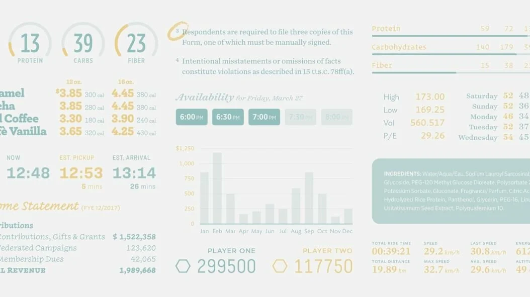
But if the font size is made smaller than the main text, then even the most legible font will be difficult to read, the distance between the letters will be too small, the inner letter clearance is too narrow, and the height of the lowercase letters is negligible. Compare the small fonts in these two examples.
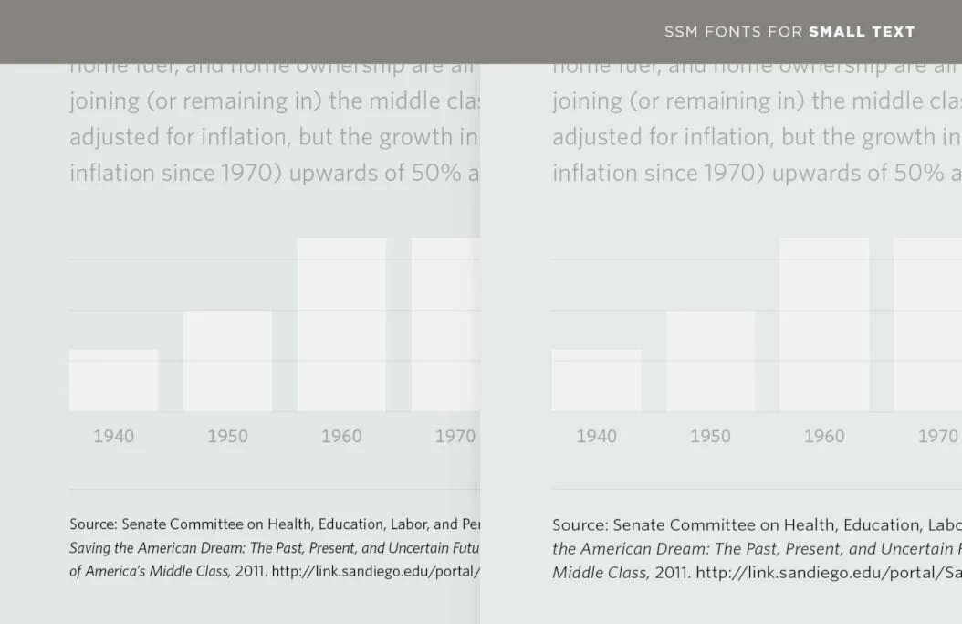
Fortunately, the fonts were specially adapted for web pages and show themselves well on any device. Font Family ScreenSmart It was created in order to fill the shortcomings of a small size.
Above are two types of layout where the Whitney font family is used, and on the right for a small print under the graph is Whitney ScreenSmart. Fonts ScreenSmart always give greater clarity, they are more comfortable to read, which means they are perfect for small spelling.
Working with lists
Small font – the curse of typography, and it’s not only in its size, but also in a large amount of information. Clarifications, declarations of liability and lists of ingredients are most often ignored by readers, but they can be attributed to the most strictly regulated parts of any typographic object, and therefore this content is carefully looked through.
Raise your hands to those who have ever received a request from the legal department to make a few more suggestions in the text after the design has already been approved. Raise up your hands if it was not a request.
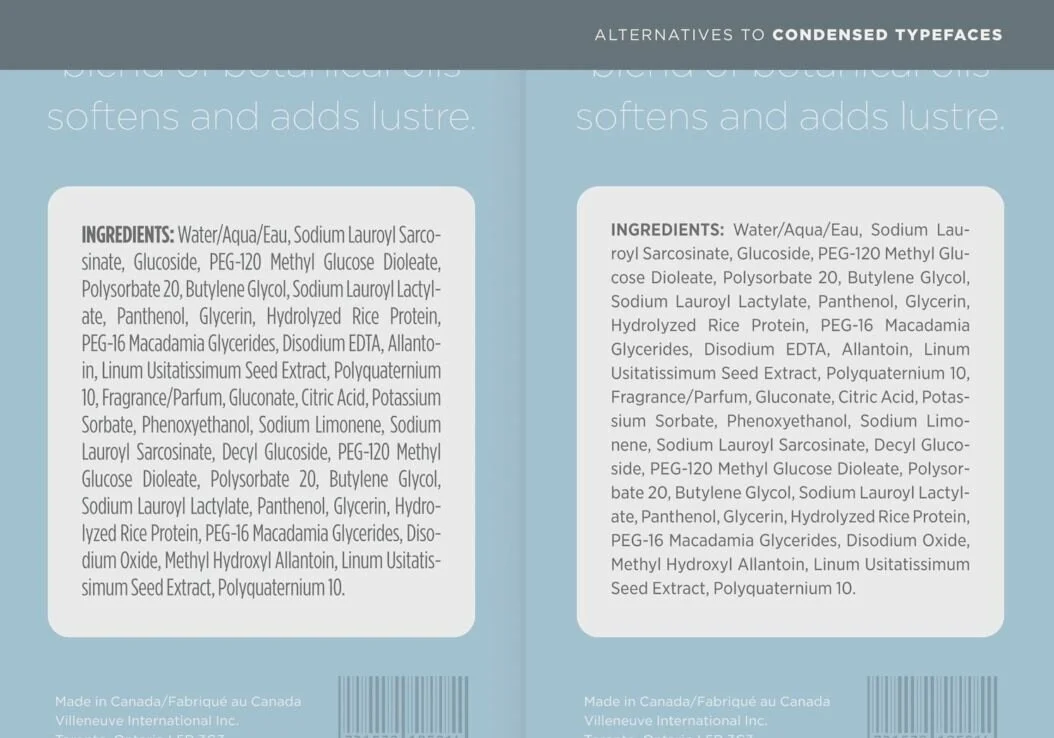
The first thing that a non-designer comes up with is to take a font that is narrowed by the principle: the narrower the letters, the less space they will occupy. However, it is almost always better to go against intuition and choose a wider type of font, and then set a smaller size for it with a closer arrangement of letters to each other.
Wider letters have more comfortable proportions, they are located with a large interval from each other and with sufficient letter-space gaps, and all this makes them an easy-to-read option.
Above are two lists of ingredients in the font Gotham: left admissible Gotham Condensed, and on the right is much more attractive Gotham Narrow. Tip: For maximum legibility of the font, you should use a wide font not only in the main text, but also in an additional font ScreenSmart.
Working with a set of characters
Imperceptible notes – this is a chance for the designer to show his creativity, as well as an occasion to try the brighter characters from the set of signs. The indexes of footnotes, beginning with an asterisk and a cross, sometimes become a pleasant addition to the dry content of the footnote itself. But if the document has more than three footnotes, it is better not to use them.
With symbols such as *, † and ‡, users are still sorted out, but with their repetition like **, †† and ‡‡ – or §, || and # depending on what you are used to in your company, it will be harder. If there are more than three footnotes in the text, it is better to follow all the clear numbered list in the upper index.
Chronicle Text Grade 2 Pro
Superindexes are included in each font H&Co, which has a version of Pro, as well as they are in Gotham, Ringside and Inkwell. Tip: In the text, note footnotes with the help of superindexes, which rise above the capital letters. But in the footnotes themselves it is better to use the numerator, because it is located below. So the link between the numbering and the text of the footnote is better visible, and the footnotes are more clearly visually separated from each other.
Figures, numbers, figures
In the same Pro sets except for superindexes and numerators, there are tabular or monospaced digits, this is the most important digital part of any font. Unlike the traditionally proportional characters of any font, whose width varies depending on the natural form of each number – 1 – always narrow, and 0 – rather wide – the table numbers have the same width, so the width of the columns in which they are located always coincides.
Table numbers have a second important characteristic: their width does not change depending on the font’s saturation. In the ordinary font, everything is arranged differently: there the more saturation, the wider the symbols.
This is one of the main characteristics of tabular figures, known as "duplexing", because it allows designers to select individual lines in bold, without violating the width of the column.
Tip: the very word “tabular” can mean complex tables in applications to annual reports and disclosure of financial information, but do not forget that often a huge number of figures appears in other contexts.
Tabular numbers are important, for example, for menus, catalogs, directories, and generally for everything where prices, statistics, account numbers, points or any other data dynamically changed online.
Any digital experience with variable figures, for example, stock prices, sports scores, commodity code of the goods, exchange rate, flight numbers, schedules, requires the use of tabular figures. So it’s better to work with tabular figures from the very beginning of the project.
Creative choice
Advanced digital symbols, like table numbers and superindexes, are not the prerogative of commonly used font families, and in general not every project requires rational serif or sans.
When the complexity of the project requires a reliable font, and the theme of the project implies an individual approach, it is better to look for non-obvious fonts that have additional digital capabilities.
For example, handwriting Inkwell has everything you need to convey the subtleties of content, while it looks less strict, which means it is more suitable for areas such as entertainment, retail, catering, arts, pediatric care, and even philanthropy.
Tip: if you plan to use symbols of the same saturation in tables, you should pay attention to such fonts whose numbers have the same width, and where they are not duplicated by saturation (usual – bold).
In our collection Numbers there are fonts Indicia, Claimcheck, Revenue and Greenback, in which the numbers are the same width, the same with interesting figures in any saturation in the font Inkwell Blackletter.
Individual advertising and information materials of the brand
The last contribution to visual communication is usually done not by designers, but by software. Often these are text editors, spreadsheets and programs for creating presentations that should be spoken by the organization, but they lack the tools to do it properly. For such projects, we created Office Fonts.
Office fonts are an adaptation of frequently used fonts from H&Co, specially created for use in business solutions such as Word, Excel and PowerPoint. These are the same font families whose ScreenSmart The version is well used for small text and whose professional character sets are suitable even for the most complex data.
We rethought a set of Office fonts for use by non-designers, and limited each of the included family of fonts with just four shapes (direct, oblique, fat and bold oblique). In addition, this set contains only tabular figures to avoid typographical failures that might go unnoticed.
And yet these fonts are uploaded to the format TrueType For maximum compatibility, even with the oldest operating systems.
Tip: if the brand communications ultimately will occur through reports, proposals, regulations and presentations, it is better to develop these documents from the very beginning with Office fonts in order to take advantage of their unique characteristics.
